Friday, July 1, 2011

Week 9 Blog

This piece was created by April Greiman for Design Quartely in 1987. The picture is compose of digitized images from a low resolution printer. She was a great graphic designer and has made some stunning piecies. However, the piece below was not all that great to me. Okay I think its nice that she was able to take video and digitize them , while layering them.  That whole aspect is good as it was the eighties, but to me this garbage anyone can put something like this together in my opinion. We live in age where anything can be put off as art. My opinion of the art world for most occassions is its all about who you know and money, and those are the people who become famous. Even if this picture took two years to create somebody else could have made something more inspiring. I find this picture disturbing.  It sort of feels like a Dadaist picture to me. I do not like all the clutter in this collage with its subtle hints to the meaning of the design. I think this piece is distracting.  The pros of this piece would be that she was able to put these many images together in this format during a time where technology was slowly progressing.

Saturday, June 25, 2011

Creative Brief 3

What is the problem?

This piece is a theater poster called Sudafrikanisches Roulette (South African Roulette). Gunter Rambow designed the poster in 1988. The problem was creating a poster that would signify the suffering and revolution of the people that was occurring in South Africa.

Who is is the client?

Gunter Rambow most likely created this poster on his own terms for creativity and to deliver a message to the world about events in S. Africa.

Who was the project designed for?

The project seems to be designed for Germany, S. Africa, and anyone willing to take the time to view it and embrace the emotional content that he was displaying with this piece.

Who is the intended audience?

The intended audience would be Germany as its written in German. However because of the design anyone could be the audience. The design sends out a comprehensive and emotional message. The viewer should be able to understand the message even without knowing that the words read South African roulette in German.

What is the core message?

This design was used to express the hardships and revolution that the people of Africa were facing daily. I showed pain, occurring in a country.

What is the graphic strategy?

Rambow’s poster showed a bandage covering a bloody hand, which left a bloodstain of Africa. This strategy was thought out well and very effective. It delivered the message of pain and help at the same time. The strategy of showing a bloody mark on one’s hand makes me think of pain and when he turned that blood into a silhouette of Africa it all came together.  I feel that others will feel the same way after having observed his art piece. Rambow was a brilliant designer where his pieces communicated his messages in a very unique and emotional way.

Week 8 Blog

GEORG OLDEN, STAMP FOR THE CENTENARY OF THE EMANCIPATION PROCLAMATION, 

The stamp for the centenary of the Emancipation Proclamation was created by Georg Olden, he was the head of the network's division of on-air promotions at the dawn of television, Olden pioneered the field of broadcast graphics. He was also an artist and a designer. He created the piece below. I feel he captured some of the emotion of what the emancipation proclamation achieved, the locked chains are broken. Thats what I feel when I look at this piece. I also feel the colors go well with this piece because it does not use very vibrant colors that gives off a false emotion for that time, instead it gives off the more appropriate feeling of that time period dark, and cold. Without even reading the words, I get freedom, and release  from looking at the broken chains. I think it was a good design for one of Americas stamps as slavery  was apart in the molding of our modern day America; unfortunately. 

Monday, June 20, 2011

Week 7 blog

Bunny Lake Is Missing


The Bunny Lake Is Missing poster  was created by Saul Bass. I really like this poster because its different. Its different because you see this cardboard piece but you see the shape of a small child that has been cut out that might signify that she was abducted. It looks as though she was holding someones hand. I think this piece gives off an eery and suspenseful feeling to the viewer.  It also, gives you a sort of clue of what to suspect.  The typeface creates a mysterious feeling with its gradient. Saul's movie posters revolutionized film marketing graphics, and every succeeding film carried his distinctive design mark.

Sunday, June 12, 2011

Week 6 blog

Henry C. Beck creation for the Modern Map was a great idea and the invention of this type of map makes it easier for travelers, conductors, and anyone else looking to get from place to place. It allows one to see where they are going without all of the distractions. I feel that the bright colors that are used to portray different routes was good way to highlight the differe directions each route was going. This model of map influenced many of the maps today and has made it easier to travel becuse of the legible typograhy and highlighted paths.

Saturday, June 4, 2011

What is the problem?
This piece is called Adolf the Superman swallows gold and talks tin. It was created in 1935 by John Heartfield. The problem was creating a poster that would identify what the corrupt government of that area and time were doing to its citizens.

Who is the client?
John Heartsfield was a Dadaists also one of the founding fathers and he held vigorous revolutionary political beliefs and oriented many of the Dadaists artistic activities toward visual communication to raise public consciousness and promote social change. So, the clients would actually be the citizens, and they as a whole would have to make this change happen.

Who was the project designed for?
John most likely created this poster on his own without being hired because he wanted to. The project was designed for Weimar Republic and the growing Nazi party; they were Johns main target because they were an appalling organization and government.

Who is the intended audience?
The intended audience is the Weimar Republic, Nazis, the citizens and anyone else who wanted to know how the Weimar Republic and Nazis were operating.”

What is the core message?
This piece was used as an anti-Hitler poster in the 1932 election. It refers to the financial backing Hitler received from wealthy industrialists who feared Germany would vote for a Communist government. Heartfield's piece emphasizes that Hitler is untrustworthy and that what he speaks is not real. Also, it refers to the financial backing Hitler received from wealthy industrialists who feared Germany would vote for a Communist government.

What is the graphic strategy?
Heartfield's piece emphasizes that duality: while haranguing the crowd, which is shocked by his ravings, Hitler, whose beliefs is symbolized by the swastika plastered over his heart, is swallowing the coins of the powerful. Heartsfield display of Hitler was graphic because it showed his normal body as him speaking but showed an x-ray vision of his insides while delivering the message swallows gold and talks tin verbally and visually. This was a great piece and the strategy of displaying who Hitler was and what he was involved with was accomplished in this piece.

Week 5 blog


In class we discussed one of Pablo Picasson patintigs, called Man with Violn. This was a painitng that was created during the beginnig of the cubism era. Man with Violin in my opinion is not something I would want hanging in my living room, however, its creativity of shownig the planes of the subject from diffrent vantage points, while also fracturing the image is unique, and definetly conveys the new style of art, cubism.

Friday, May 27, 2011

Week 4blog


During week 4 we discussed Frank Lloyd Wright; he was an american architect, designer, writer, educator, who designed more than 1,000 projects , and 500 completed works. Some of his work can be seen here in Peoria on Moss avenue. He work evolved from curvilinear art nouveau to rectilinear approach to ogranizing space. He combined varied mateiral int a unified whole. His work used a lot of asymetrical spatial organization while using also making use of white space. I personally like Franks houses that I created and wish to purchase one.

Tuesday, May 24, 2011

Industrial revolution

Industrial revolution, people left farms and began working in factories. It was a time when power was being transferred from capitalist manufactures, merchants and and working class. Cities were growing more quickly and the wealth was being distributed. The supply and demand drove more production in this era.

Monday, May 23, 2011

Identity


This is my identity for my company.

Wednesday, May 18, 2011

Possible Logo Ideas
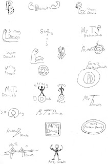
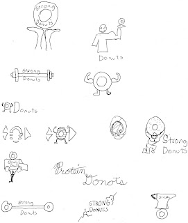
For my project, I have chosen the donut industry. My product will transform fast food breakfast from a sweet treat to a more health conscious treat for athletes or anyone looking to add more protein in their diet. I have several ideas for logos for my product. I have narrowed it down to one. I am leaning towards the atlas type character holding up a donut. Check out my logo ideas below.

Tuesday, May 17, 2011

Week 2blog


John baskerville created a new type. The new type treatment had larger serifs, they were wider and heavier with contrast. The placement between thick and lines differed from previous typefaces. It had sturdy textures that are comfortable and friendly. It was uneven and rhythmic textures creates visual interest

Monday, May 9, 2011

Brief Typography information

Typography created in the mid 1400's, when it was created by a German inventor, is the term for printing with independent, movable, and reusable bits of metal or wood, each with a raised letterform on top. The creation of typography ranks near the invention of writing as one of the most important advances in civilization it allowed the economical and multiple production of alphabet communication, and because of this knowledge was able to be spread rapidly. People were becoming more intelligent as a result. If one wanted to purchase a book during this time they had to be patient as it took 5 months for a 200 page book for a scribe to complete it.

Creative brief
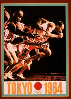
This piece is an Olympic poster created in 1964 by Yusaku Kamekura and Osamu Hayasaki. When global attention focused on Japan’s for the 1964 Olympics, the logo and posters he created for these events received international acclaim and established Japan as a center of creative design. According to the Graphic Design book, the artists work are modern and evoke the poetic traditions of Japanese art and the emblematic simplicity of his constructivist geometry and international style-inspired typography is the result of an extraordinary complexity where all parts are unified into an expressive whole.

I think the message, that the client and the designer wanted to communicate was that it was the Olympics and that Japan was a creative, strong, and competitive society. I think they were very successful with their outcome. One part of the message is literal, and can easily be understood by reading the poster, but the visual design might also say that there is equality and competiveness, in the Olympic experience. I feel this poster was created for publicity, identity, and marketing.

Thursday, May 5, 2011

Blog discussion

Pictograms were some of the earliest forms of communication and graphic design. Early Africans and Europeans left many distinguished paintings in caves. Some of those early paintings can be dated back to over 200,000 years. Some of the more famous paintings come from the Lascaux caves in S. Frances.