Friday, May 27, 2011

Week 4blog


During week 4 we discussed Frank Lloyd Wright; he was an american architect, designer, writer, educator, who designed more than 1,000 projects , and 500 completed works. Some of his work can be seen here in Peoria on Moss avenue. He work evolved from curvilinear art nouveau to rectilinear approach to ogranizing space. He combined varied mateiral int a unified whole. His work used a lot of asymetrical spatial organization while using also making use of white space. I personally like Franks houses that I created and wish to purchase one.

Tuesday, May 24, 2011

Industrial revolution

Industrial revolution, people left farms and began working in factories. It was a time when power was being transferred from capitalist manufactures, merchants and and working class. Cities were growing more quickly and the wealth was being distributed. The supply and demand drove more production in this era.

Monday, May 23, 2011

Identity


This is my identity for my company.

Wednesday, May 18, 2011

Possible Logo Ideas

For my project, I have chosen the donut industry. My product will transform fast food breakfast from a sweet treat to a more health conscious treat for athletes or anyone looking to add more protein in their diet. I have several ideas for logos for my product. I have narrowed it down to one. I am leaning towards the atlas type character holding up a donut. Check out my logo ideas below.

Tuesday, May 17, 2011

Week 2blog


John baskerville created a new type. The new type treatment had larger serifs, they were wider and heavier with contrast. The placement between thick and lines differed from previous typefaces. It had sturdy textures that are comfortable and friendly. It was uneven and rhythmic textures creates visual interest

Monday, May 9, 2011

Brief Typography information

Typography created in the mid 1400's, when it was created by a German inventor, is the term for printing with independent, movable, and reusable bits of metal or wood, each with a raised letterform on top. The creation of typography ranks near the invention of writing as one of the most important advances in civilization it allowed the economical and multiple production of alphabet communication, and because of this knowledge was able to be spread rapidly. People were becoming more intelligent as a result. If one wanted to purchase a book during this time they had to be patient as it took 5 months for a 200 page book for a scribe to complete it.

Creative brief

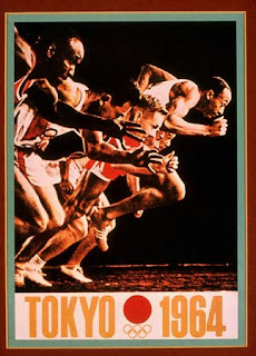
This piece is an Olympic poster created in 1964 by Yusaku Kamekura and Osamu Hayasaki. When global attention focused on Japan’s for the 1964 Olympics, the logo and posters he created for these events received international acclaim and established Japan as a center of creative design. According to the Graphic Design book, the artists work are modern and evoke the poetic traditions of Japanese art and the emblematic simplicity of his constructivist geometry and international style-inspired typography is the result of an extraordinary complexity where all parts are unified into an expressive whole.

I think the message, that the client and the designer wanted to communicate was that it was the Olympics and that Japan was a creative, strong, and competitive society. I think they were very successful with their outcome. One part of the message is literal, and can easily be understood by reading the poster, but the visual design might also say that there is equality and competiveness, in the Olympic experience. I feel this poster was created for publicity, identity, and marketing.

Thursday, May 5, 2011

Blog discussion

Pictograms were some of the earliest forms of communication and graphic design. Early Africans and Europeans left many distinguished paintings in caves. Some of those early paintings can be dated back to over 200,000 years. Some of the more famous paintings come from the Lascaux caves in S. Frances.