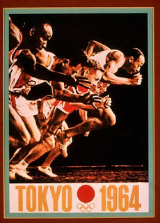
This piece is an Olympic poster created in 1964 by Yusaku Kamekura and Osamu Hayasaki. When global attention focused on Japan’s for the 1964 Olympics, the logo and posters he created for these events received international acclaim and established Japan as a center of creative design. According to the Graphic Design book, the artists work are modern and evoke the poetic traditions of Japanese art and the emblematic simplicity of his constructivist geometry and international style-inspired typography is the result of an extraordinary complexity where all parts are unified into an expressive whole.
I think the message, that the client and the designer wanted to communicate was that it was the Olympics and that Japan was a creative, strong, and competitive society. I think they were very successful with their outcome. One part of the message is literal, and can easily be understood by reading the poster, but the visual design might also say that there is equality and competiveness, in the Olympic experience. I feel this poster was created for publicity, identity, and marketing.
Good discussion, but try to avoid just copying content from the text. If you quote it, be sure to cite it! For a little more structure, follow the format discussed in class and in the syllabus, and break down items into sections. Great poster design though!
ReplyDelete